How simplifying checkout reduces abandonment by 28% and increases conversion by 21%
About
Fresh is a global lifestyle line of skincare, lip care, bodycare, and fragrance products sold all over the world. It is mostly sold online, but does have over 50 brick and mortar stores.
My role
UX research, usability testing & design, UAT
Challenge
Redesign the cart and checkout experience on mobile & desktop for web to improve customer shopping experience
Timeline
6 months
Goal
Reduce friction and cart abandonment to drive revenue, conversion, and average order value
Challenges & constraints
Understand the business needs
International functionality
Consider international currency & language in design
Numerical placeholders pricing
Assistive copy character counts
International delivery restrictions & nuances
Associate feedback
Consider international Fresh retailer leader’s pain points and requests
They wanted a stepper to help customer understand stage of checkout process
Process
How I arrived at a solution
Usability testing
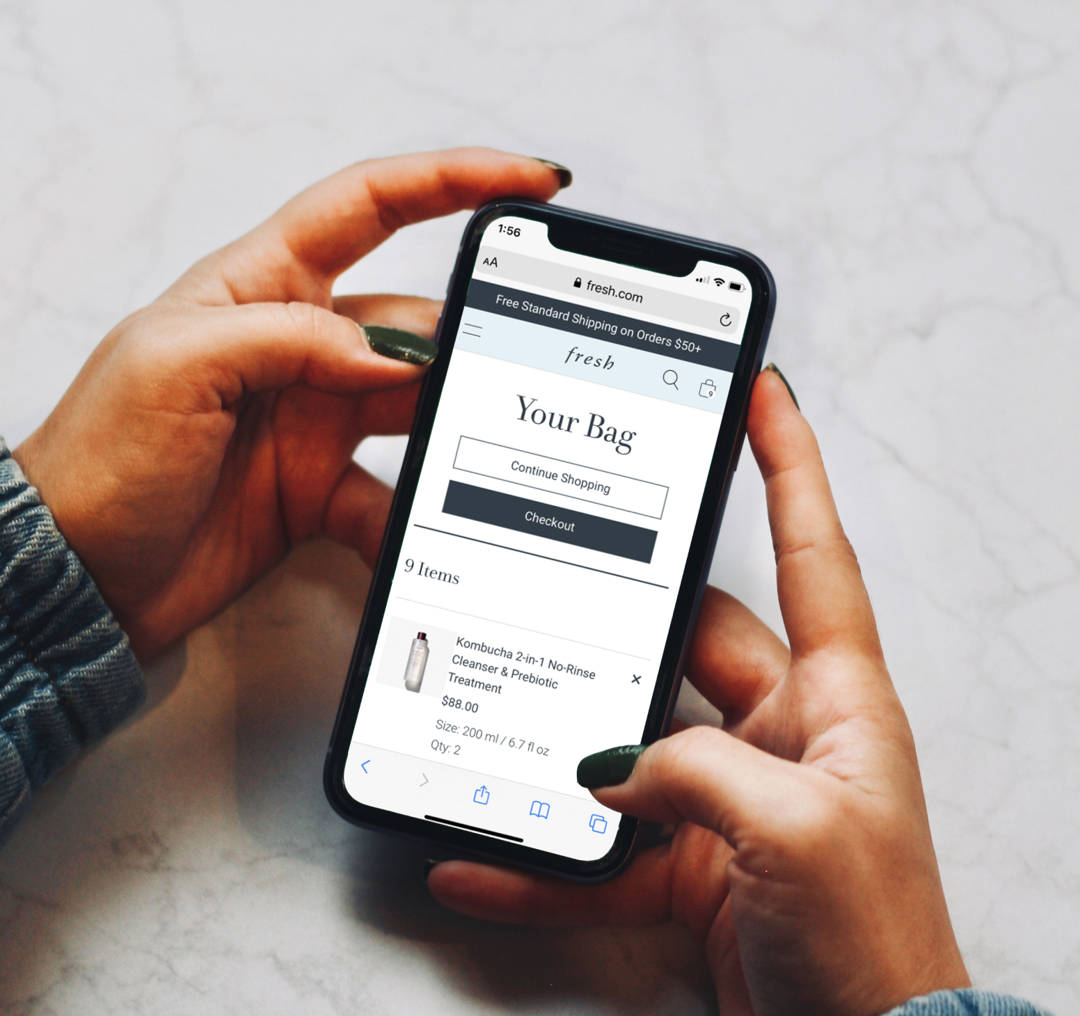
Conducted an audit of current cart & checkout experience
Usability testing on current cart & checkout
4 users, in-person
2 males, 2 females
Moderated test
Guest checkout flow on mobile
Usability testing
User insights from current experience
Payment page & order summary page are so similar, user thought they placed order on payments page
User has to scroll a lot to find information
After landing on order summary page, one user said:
“I thought I already placed the order...I would leave”

Research
According to a recent Shopify study, a long and complicated checkout process is the reason behind 26% of shopping cart abandonments.
Shopify, 2021
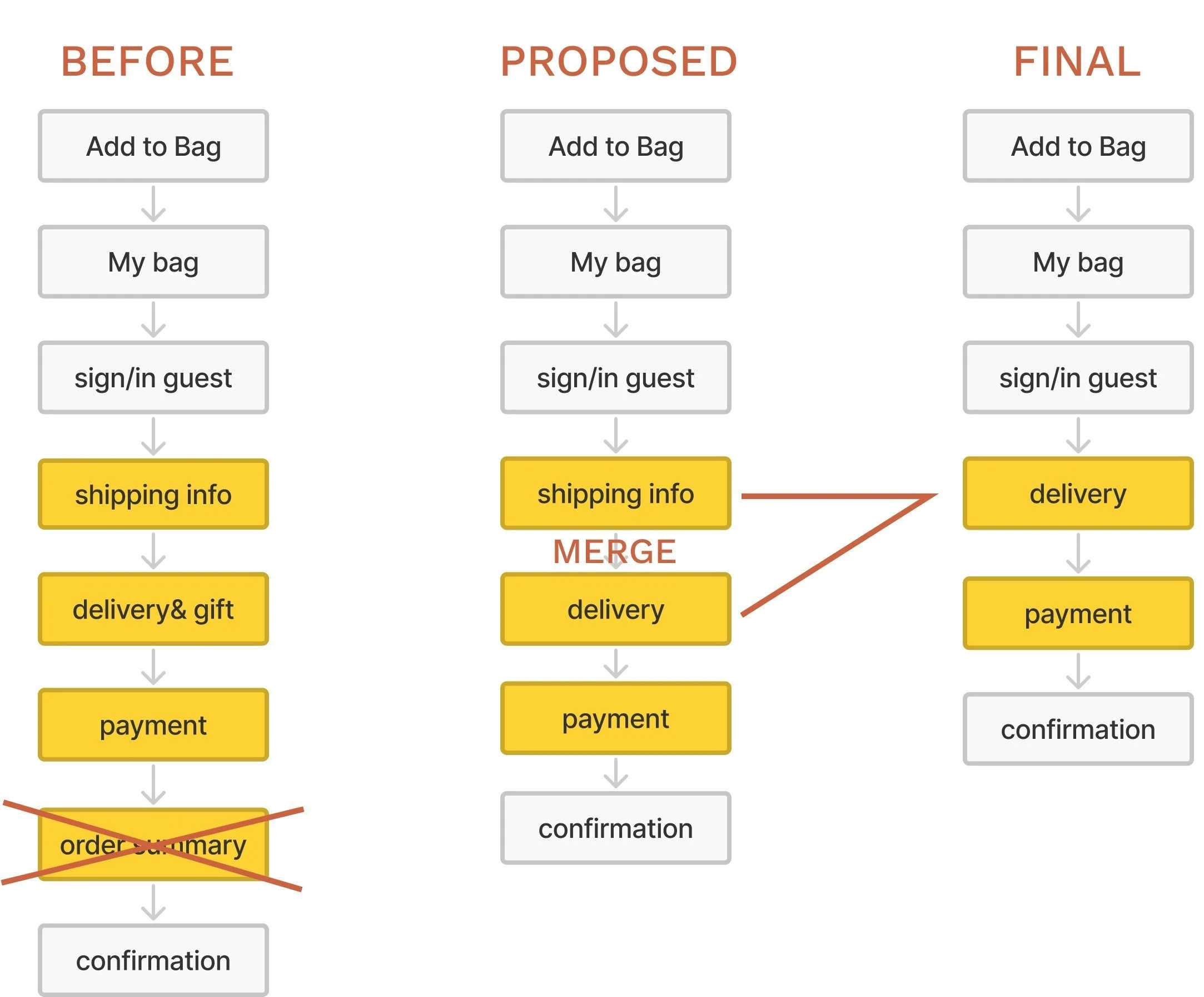
Initial user flow
To reduce confusion in checkout, proposed removing the order summary step and some uneccessary form fields
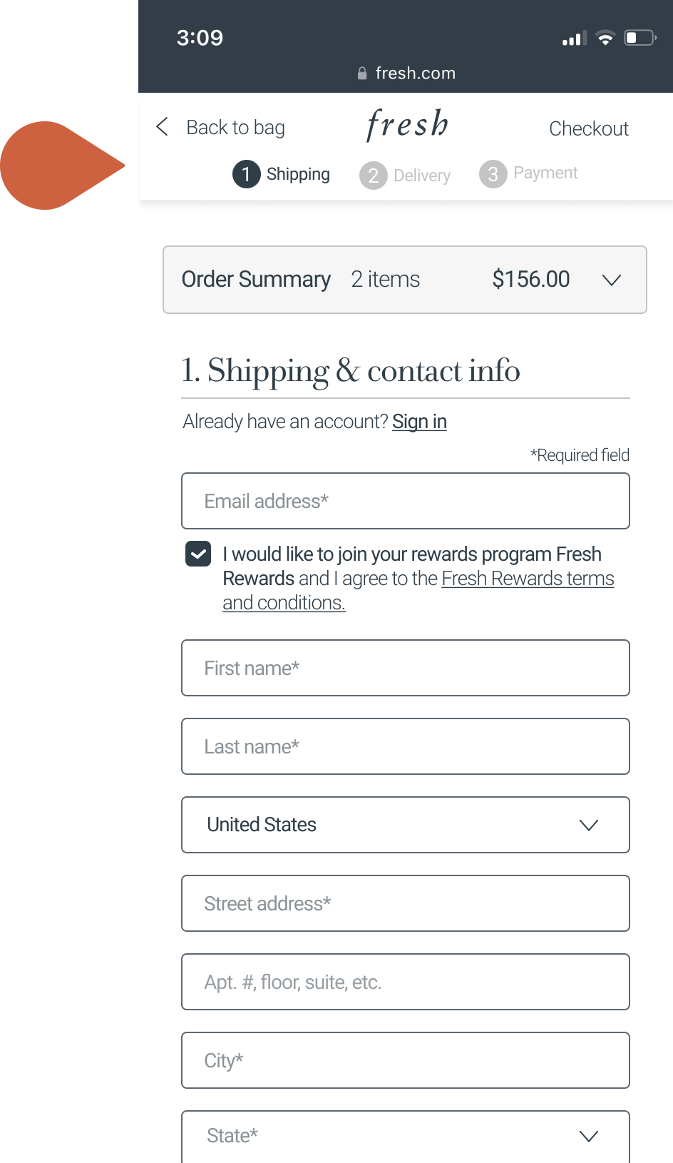
Initial design
First design iteration was divided into 3 steps: Shipping, Delivery, Payment
To show steps, I used a progress indicator
I thought this was final design
However, a new unexpected issue emerged...
Unexpected issue
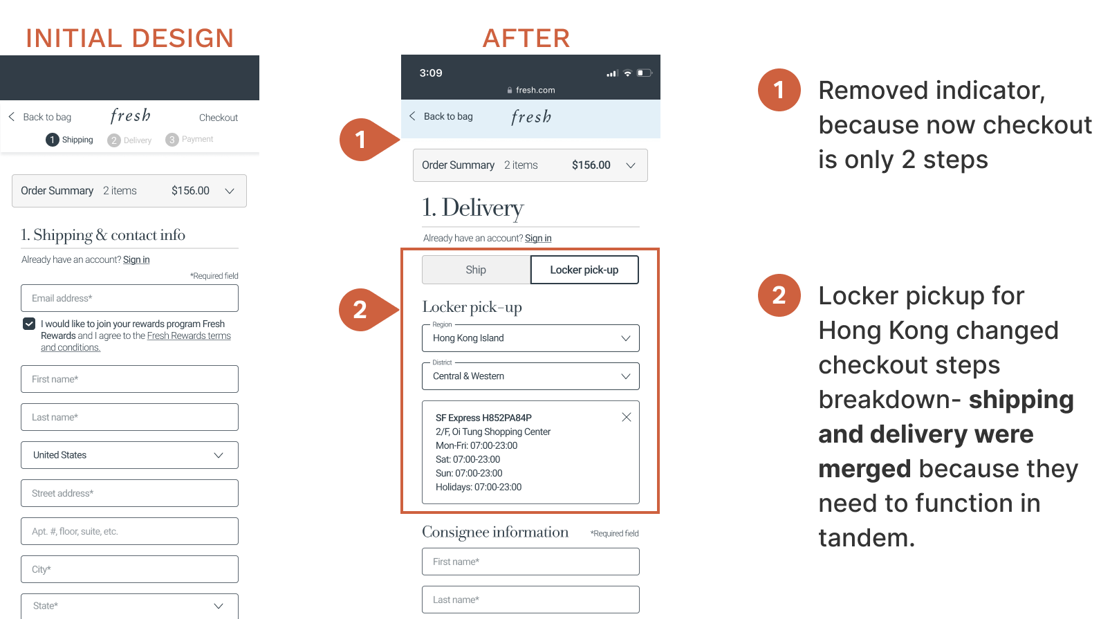
We realized the Hong Kong market needed an option for locker pick-up and had to update the design to accommodate.
During height of covid this was the only way customers could get packages.
Design iteration
I decided to remove progress indicator & add locker pickup option to delivery step
Final user flow
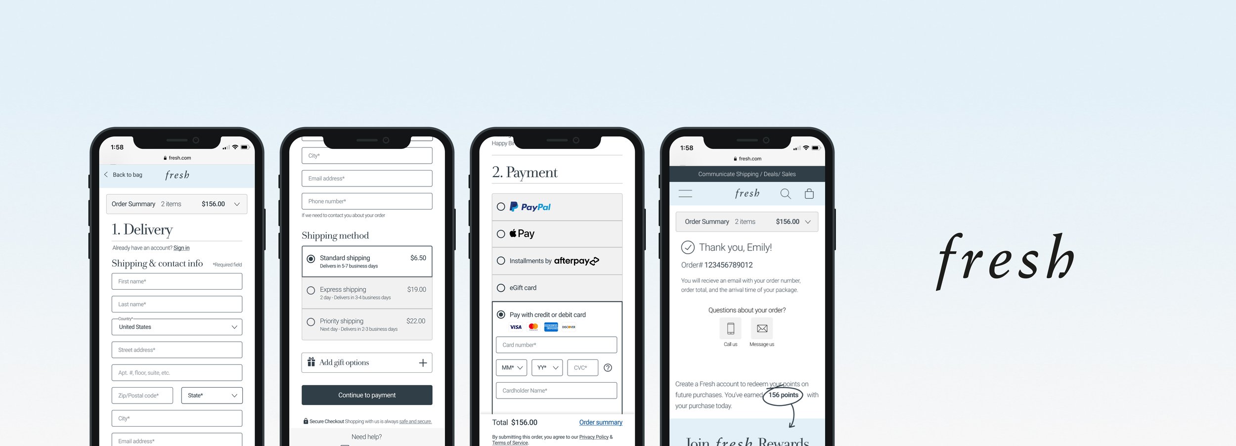
This reduced the checkout flow to 2 steps
The locker option issue actually pushed design to be better and shorter for the user
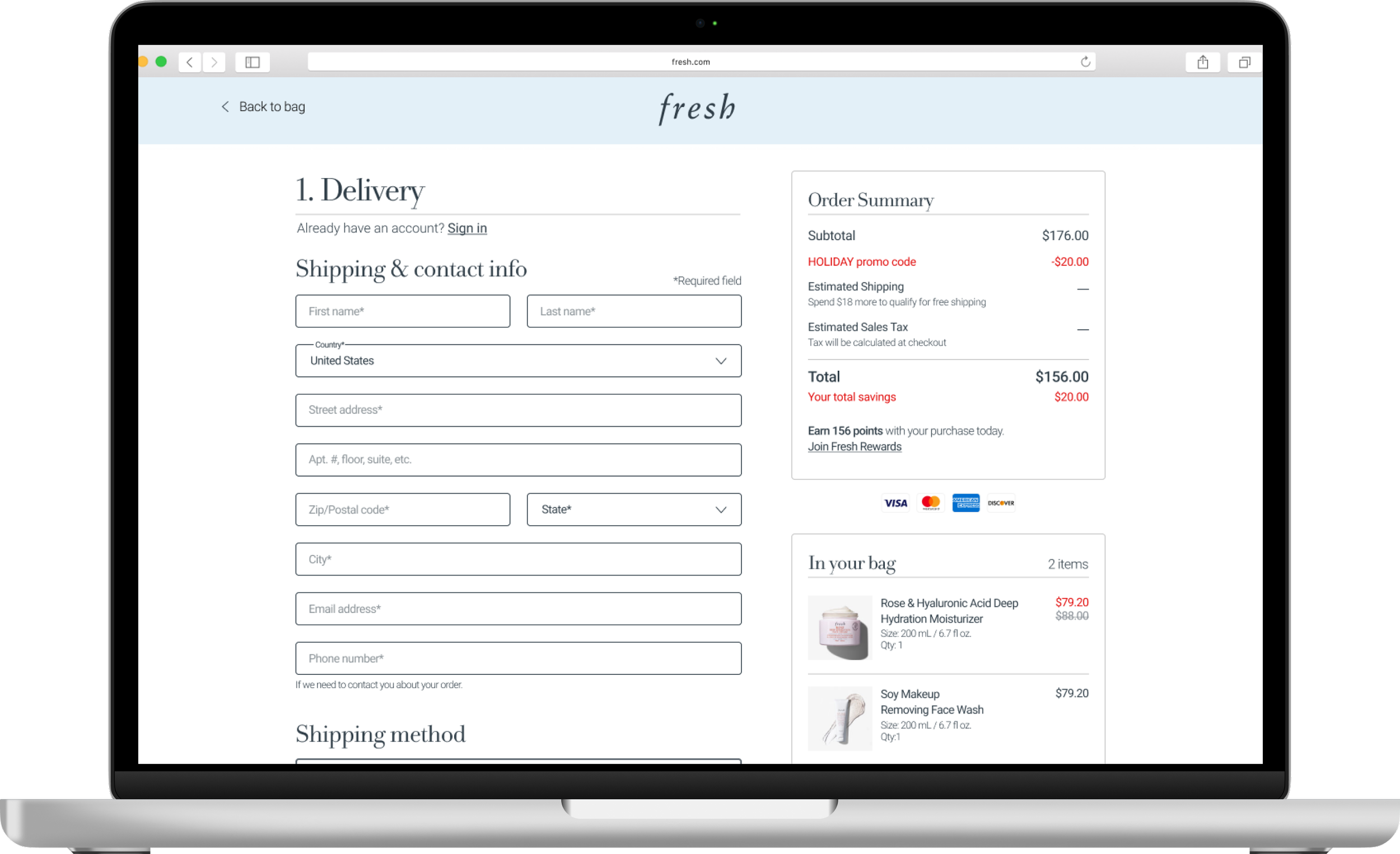
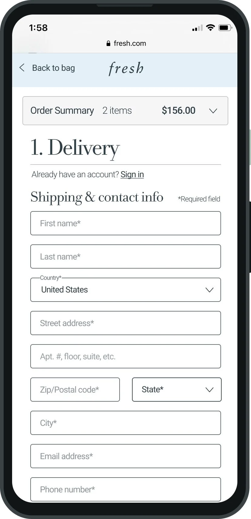
Final design
Desktop & mobile
Results
Reduced abandonment and improved conversion in checkout
- 28.49% abandonment compared to Pre - Redesign (GA)
+ 21% conversion compared to Pre - Redesign (CS)
Good exposure rates for all users (>80%), not too much friction at the top of the page causing users to leave
Learnings
Stakeholder requests are only valuable if they solve a problem, don’t let that restrict possibilities for a new design
On future projects, try to map out global challenges in the beginning if possible
Stay flexible and trust the process
Further iterations
Fresh checkout data 3 months post-redesign: Apple Pay + PayPal transactions have increased by 17.14 % compared to Pre – Redesign
Explore other ways to expedite the customer through checkout with this new data


