
How simplifying customization can increase customer confidence
About
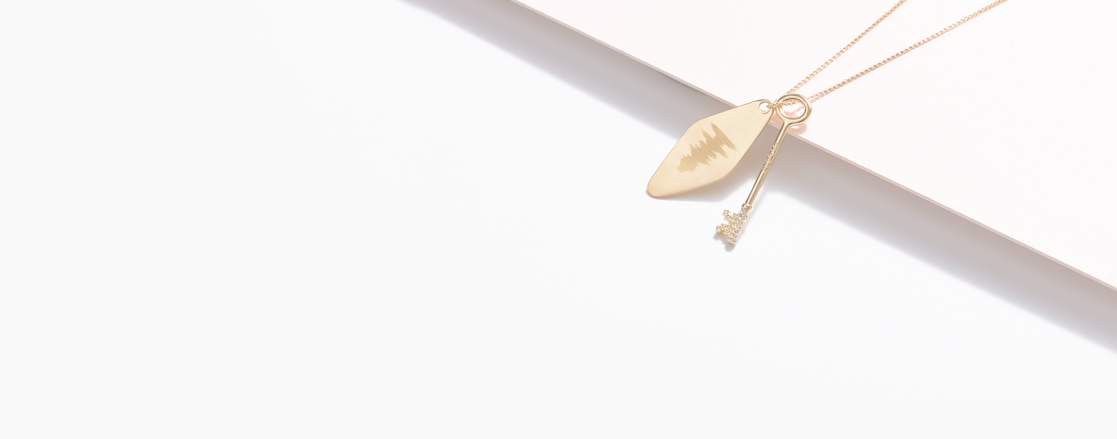
Capsul is a custom jewelry company that uses 3D-printing technology to design, cast, and customize jewelry using handwriting samples, the sound wave people’s voices, and a special engravings commemorating names, places, or dates.
My role
For this project, I led a team of UX designers and served as project manager. We delivered a UX audit, competitive research, UX strategy, prototyping and user testing.
Team
Challenge
To increase Capsul Jewelry’s website conversion rates and improve sales
When we met with the client, their conversion rate was 0.7% which is below average of most e-commerce website. The client wants to double the conversion rate with a goal of at least 1.5%.
Timeline
This was my 6-week remote industry design project to complete my certification for Springboard’s UX design track.
Process
How we arrived at a solution
Usability testing
Conducted an audit of current desktop experience
After meeting with the client, our team jumped right in and conducted a design audit of Capsul’s current website. We did 6 remote moderated usability tests. Based on the client’s information, the target audience for Capsul Jewelry were women ages 25-45. We wanted to get a jumpstart on user issues and compare that to the google analytics.
Users were confused about what difference between base metals and color/finish when customizing jewelry
Users weren’t clear about engraving options
Google analytics
We had 3 big discoveries from reviewing data
75% of customers are mobile users
This was a major insight for the team and our client confirmed that she wanted her website to be created mobile-first. After this discovery, we user tested 3 more people on the mobile version of the website, so we were aware of any issues caused by mobile.
50% drop off between cart and shipping
According to the data, customers were bouncing between the cart and shipping. There could be a myriad reasons customers drop off. Unfortunately, because our client uses Shopify to host her transactions, this is something we could not address at this time.
Friction with navigating from the landing page to the collections page.
Based on the highlighted traffic route in google analytics, we could see that users are moving back and forth between the landing page and the collections page. This might indicate there are issues with the navigation.
Usability testing
We had to go back and conduct usability tests on mobile knowing 75% of user shop on their phones
After learning that the majority of customer’s were shopping on their phones, we conducted another round of user testing with the same tasks as the desktop website test. We didn’t want to miss any new user pain points that would come about while shopping the website on mobile.
• Pop-up windows blocked users visibility and they had to close them multiple times.
• With smaller viewing area user had to scroll up and down to customize a piece.
Focus on problem
What part of the customer’s user flow would be the most impactful in changing the overall conversion rate?
Based on our design audit and the google analytics analysis, we decided to focus on the product page conversion.
We wanted to address the metal customization pain points that most users had when navigating the site. Furthermore, we learned that in e-commerce the product pages are the landing pages.
Understanding the customer
Meet Rebecca, she wants to quickly find a special gift and be confident that it will be customized correctly and delivered on time
Customer journey
Buying a customized Signature ID necklace
Based on our user testing insights, we charted Rebecca’s customer journey buying a Signature ID Necklace which was one of Capsul’s bestsellers. This helped us identify the specific pain points she might encounter when customizing a piece of jewelry.

How might we simplify the customization process for Rebecca, so she is confident about buying custom jewelry online?
Ideation
After we figured out what solutions we wanted to test, we needed to design a prototype to test our hypothesis
Each designer sketched up some ideas and we presented them to each other. We reviewed all of the ideas and conducted a heat map vote using dots to see what the team collectively wanted to pursue. We started off with Jill’s sketches as a launchpad and built upon it.
Lo-fi usability testing
We tested the initial prototype
For the prototype, the client wanted us to focus on the bestselling Capsul piece, the Custom ID Necklace. This was a good piece to test because it had so many different engraving options, however up until this point we were focused on the Signature Necklace. This wasn’t a big issue, we just expanded the customization options. After creating the wireframe, we conducted 6 remote moderated tests and found these issues:
Button copy should match the action
Custom product shipping information should be moved to the product page instead of checkout
Hi-fi usability testing
From our lo-fi usability testing learnings and the client’s feedback, created the hi-fidelity prototype
Each team member conducted 2 remote usability tests and he users were given the same tasks: to create two different types of engravings on the custom ID necklace.
We found that this second round was a lot smoother, but there were a couple of issues that emerged:
• Users wanted more information about “engrave later” option
• Users were confused with font engraving options.
Final design
Mobile redesign & user reaction
Learnings
Product pages are landing pages in e-commerce
Customers buy jewelry visually based on color/finish, not base material
Breaking customization process in to separate steps reduces cognitive load
Button copy should match the specific action
Users want shipping transparency when shopping
Results
Unfortunately, with the time constraints on this project, we were unable to test to see if the new prototype increased customer confidence and conversion rates. If we had continued on this project, we would have tested at least 100 users to see if the analytics revealed an increase in sales.


